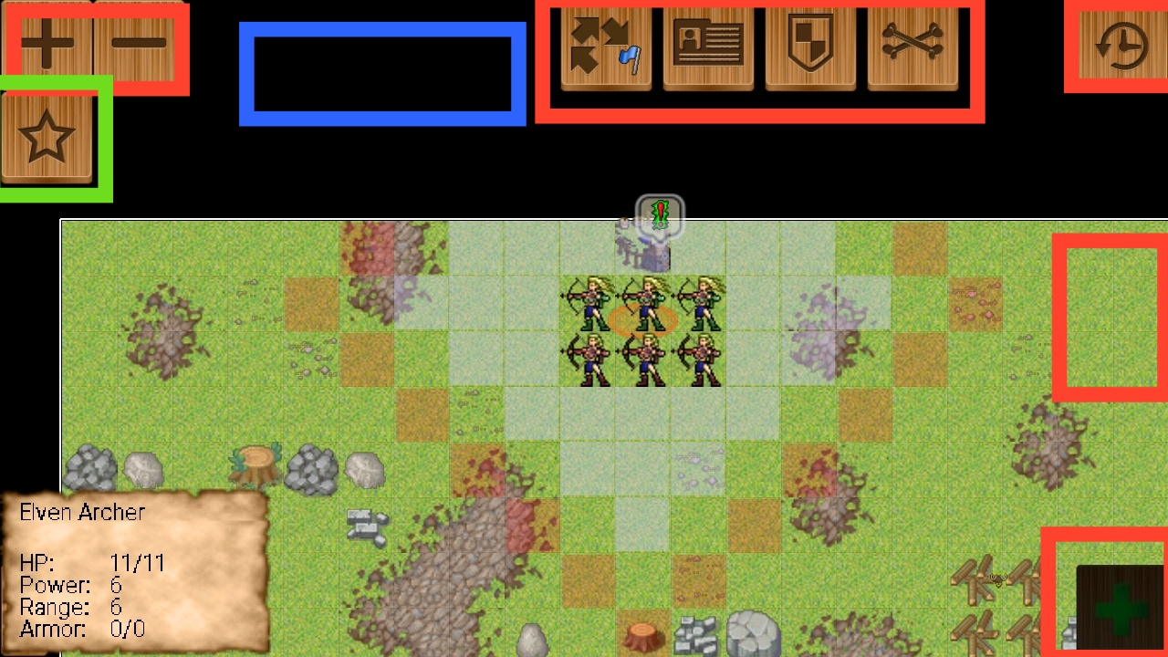
Look relevant things:
2. Lower all buttons exept of 3 dot menu size by 15-25%
ok, this is about to i think (little circles - if they will bechosen) alreadyy smaller
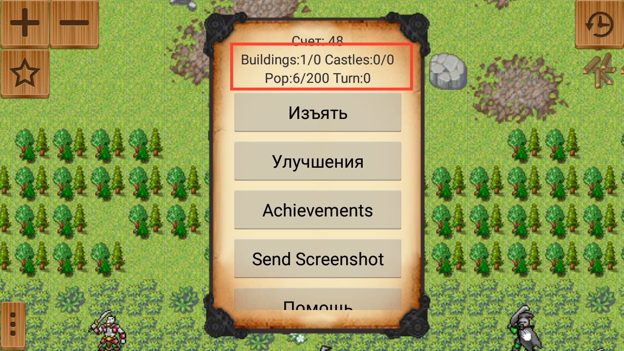
3. Add to blue field general stats: amount of buildings, castles, current turn. All info from red field in next screenshot. Also i want it to be showable and hideable like everything else.
good! any idea how this should look? i would love some image samples if u can make/find some
1. Bottom right till the bottom middle is used by unit spells so i think it is bad placement.
you are right, i thought those could go elsewhere like vertically under next turn button - but maybe we can get back with them to the top of the screen.
2. I am bad at drawing in the first place.
no problem, me too

but we can look for free "GUI design"-s to start from on the interenet.
3. Where did you place that star button near zoom buttons?
it would be undessr + - button as before, unless u suggest something else - eg. bottom left?
Also maybe instead of separating buttons try to make a full line of menu buttons on top of screen?
i saw it is not fancy nowadays - or even in mobile - so i think we should stick to these separate button or only "islands" of buttons
Logic relevant things:
1. I want to add into green openable button another button that will hide and show all red buttons. 4. I want hiding option to be in that star button.
is it necessary? i think will not really help in xtending the view, and eventually u need all buttons (eg. next turn) - maybe thezoom can be swithable but that is also small part of the view.
4. In normal settings you can choose which buttons you want to be always showable.
i think it would over configurable.